What You Saw Changed What You Heard: The Hidden Creative Power of Album Packaging
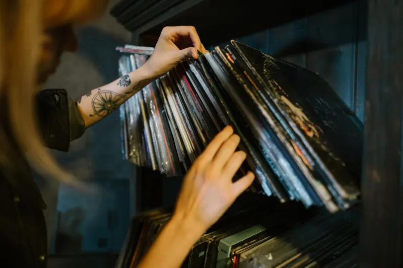
Pick up almost any classic album and hold it for a minute before you press play. Really look at it. There's a decent chance that what you're staring at isn't decoration — it's a blueprint. The colors, the typography, the photography, the way the panels fold open: all of it was, in many cases, a deliberate creative decision that reached backward into the recording studio and started moving things around.
This isn't a metaphor. It's a documented creative phenomenon that musicians, producers, and graphic designers have been navigating for decades, and collectors who live inside this world have been piecing it together one liner note at a time.
The Art Brief That Became a Track List
Here's something that doesn't get talked about enough: a lot of famous albums were sequenced after the artwork concept was locked in. Not before. The visual logic came first, and the music had to follow.
Think about what that actually means. A designer pitches a gatefold spread — maybe a panoramic image that only makes sense when you open the sleeve wide, left panel bleeding into right. Suddenly the artist is looking at two distinct halves. Two moods. Two movements. And almost involuntarily, they start thinking about which songs belong on which side, which track should open Side A to match the energy of whatever's staring back at them from the left panel, and which closer on Side B needs to feel like the image is fading out rather than cutting off.
That's not a coincidence. That's the artwork doing creative work inside the music.
Graphic designer and longtime music industry collaborator Paula Scher once described album packaging as "the first argument the artist makes before anyone hears a note." The implication cuts both ways — if the argument is already made visually, the music has to either back it up or fight against it. Most artists, given the choice, chose to back it up.
The Physical Object as Creative Constraint
There's a reason so many producers from the classic rock and progressive eras talk about "album-length thinking" as a dying art. Part of what produced that thinking wasn't just the limitations of vinyl — it was the physical reality of the packaging itself.
A double gatefold with four panels gives you real estate. You have to fill it. You have to make it mean something across every square inch, which means the music inside needs to breathe the same way. When Roger Dean was painting those floating landscapes for Yes albums in the early 1970s, the band wasn't just putting pictures on boxes. They were building a world, and then they had to make music that sounded like it came from that world. The artwork wasn't responding to the music. The music was, in a very real sense, responding to the artwork.
Flip that around and look at the minimalist end of the spectrum. When an artist commits to a stark, nearly empty cover — think the stripped-down aesthetic of certain early punk and post-punk releases — they're also committing to a sonic philosophy. A busy, ornate production doesn't make sense behind a single-color sleeve with nothing but a band name in plain type. The packaging becomes a kind of promise, and breaking that promise feels wrong in a way that's hard to articulate but immediately obvious to any serious listener.
Mixing Decisions Made in the Art Department
Some of the most fascinating stories in music history involve mixing engineers who received artwork references before they finished their work. Not as inspiration, exactly — more as a calibration tool.
The logic goes something like this: if the artwork is dense, layered, and texturally complex, the mix can hold more information. Listeners who've already processed that visual complexity are primed for sonic complexity. But if the cover is stark and confrontational, a cluttered mix feels dishonest. The ear expects something as direct as what the eye already received.
This might sound like overthinking it, but talk to anyone who spent serious time in a studio during the height of the album era and they'll tell you: the artwork reference was in the room. Sometimes literally pinned to the wall above the mixing board.
Producer and engineer Bob Clearmountain, who worked on some of the most commercially successful albums of the 1980s, has spoken in various interviews about how presentation context — including physical packaging — informed decisions about where to place elements in a stereo field. The idea that a listener would be holding something, reading something, looking at something while they listened wasn't abstract. It was a practical production consideration.
What Collectors Actually Know
This is something the collector community has understood intuitively for a long time, even if it doesn't always get framed in these terms. When a serious collector talks about a "complete" copy of a record — meaning original pressing, original inner sleeve, original insert, all of it — they're not just talking about condition grades and resale value. They're talking about the full sensory experience the artist intended.
Strip away the packaging and you haven't just lost some cardboard. You've lost part of the argument. You've lost the visual context that was supposed to arrive before the music did, priming the listener's nervous system for what was coming.
This is why so many collectors get almost irrationally frustrated by CD reissues that slap the original artwork on a jewel case insert and call it a day. The image might be technically accurate, but the scale is wrong, the texture is wrong, the weight is wrong. And if the original packaging was part of the creative system that shaped the music inside, then a shrunken, laminated approximation of it isn't really the same artifact. It's a copy of a copy.
The Relationship Still Exists, Just Differently
It would be easy to write all of this off as nostalgia — a eulogy for an era when physical media made these creative relationships possible. But that's not entirely honest.
Artists who still release physical product, particularly in the indie and experimental spaces, are absolutely still thinking this way. Limited edition packaging with hand-numbered inserts, custom-printed lyric booklets, deliberately oversized sleeves designed to feel wrong in a standard rack — these choices are creative statements, and they're still shaping the music they contain.
The difference is that the audience for that experience has narrowed to the people who specifically seek it out. Collectors. Audiophiles. The folks who pre-order the deluxe edition not because they need four extra tracks but because they want the full argument the artist is making.
And when they finally sit down with that record, that CD, that carefully constructed physical object — and they hold it and look at it before they press play — they're participating in something that goes a lot deeper than nostalgia. They're letting the artwork do its job. The one it was always meant to do.