Before the Algorithm: How CD Cover Colors Were Calling the Future of Music
Spotify has a whole team of engineers trying to figure out what you want to hear next. Turns out, a handful of graphic designers in the '80s and '90s were already doing that job—and they were doing it with nothing but a pantone swatch and a gut feeling.
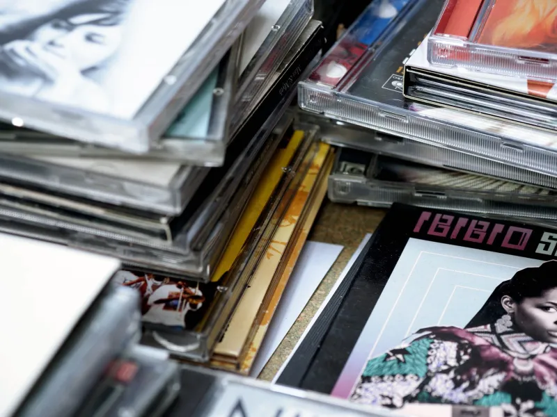
For collectors who've spent years building physical libraries, something keeps nagging at them when they line up their CDs on a shelf. The colors cluster. The aesthetics group themselves. And when you start tracing those groups across release dates, a weird pattern emerges: the visual language of an album cover often arrived before the sound it was predicting had fully taken over mainstream culture.
That's not a coincidence most people talk about. But maybe it should be.
Neon Was a Warning Sign
Pull out anything from the synth-pop golden era—your Duran Duran, your Flock of Seagulls, early Depeche Mode—and the color story is almost embarrassingly obvious in hindsight. Hot pink bleeding into electric blue. Gradients that look like a Miami sunset had a nervous breakdown. Fonts that seem to vibrate off the plastic case.
At the time, those choices read as pure aesthetic maximalism. Looking back, they were a roadmap. The neon saturation on those covers wasn't just matching the synthesizers inside—it was telegraphing a whole cultural posture. Excess. Spectacle. Volume for its own sake. By the time the general public caught up to what synth-pop actually was, the covers had already been screaming about it for two or three years.
Collectors who focus on this era have started calling it "color-forward" design—the idea that the visual package arrived at the cultural conclusion before the music itself fully did. It sounds like a stretch until you start pulling the actual release dates and watching the palette shift in real time.
The Great Drain: How Alternative Sucked the Color Out
Then the '90s happened, and it's like someone pulled the plug on the whole color wheel.
The shift is so dramatic across physical CD collections that it almost looks staged. Nirvana's Bleach was practically monochrome. Early Pavement releases looked like they'd been designed on a broken photocopier. Sebadoh, Guided by Voices, Liz Phair—the indie underground was working in a palette that seemed deliberately hostile to anything the previous decade had celebrated.
Desaturated greens. Washed-out browns. Whites that weren't quite white. Photography that looked like it was pulled from someone's shoebox of forgotten snapshots.
The interesting thing is that this visual retreat preceded the mainstream breakthrough of alternative rock by a meaningful margin. The aesthetic was already communicating anti-spectacle before most American radio stations had any idea what was coming. Designers working in that space—many of them operating out of small regional scenes with almost no budget—were collectively arriving at the same visual conclusion: the neon era was over, and something rawer was replacing it.
They weren't running focus groups. They were just reading the room, somehow, before the room had fully assembled.
2000s Indie and the Chaos Palette
If the '90s drained the color out, the early 2000s indie explosion poured it all back in—but scrambled. Broken Social Scene album art. Early Arcade Fire packaging. The Decemberists doing Victorian illustration. Animal Collective looking like a fever dream someone illustrated by hand.
This wasn't neon maximalism. It was something more anxious. Clashing palettes that didn't resolve. Illustrations layered over photographs layered over textures. A deliberate visual noise that felt less like confidence and more like everyone shouting at once.
And that, it turns out, was exactly the cultural moment. The early internet was fracturing music consumption. MySpace was turning every band into its own broadcaster. The old gatekeeping structures were collapsing. The chaos on those CD covers—the maximalist, everything-at-once visual overload—was tracking something real about how people were experiencing music. Not as a singular genre statement, but as a thousand simultaneous signals.
Collectors who catalog this period have noted that the fragmented aesthetic actually makes it harder to organize physical releases. There's no clean visual throughline the way there was with synth-pop or early alternative. Which, again, feels like the point.
Were Designers Actually Predicting This Stuff?
Here's where it gets genuinely interesting—and genuinely murky.
Talk to the designers who worked on major-label and indie releases through these decades, and most of them will tell you the same thing: they weren't trying to forecast anything. They were responding to the music in front of them, working within tight budgets and tighter deadlines, making calls that felt right for the project.
But that explanation might actually make the pattern more significant, not less. If designers weren't deliberately encoding cultural predictions into their color choices, then those choices were coming from somewhere more instinctive. They were absorbing the same cultural signals that the musicians were—the same anxieties, the same optimisms, the same underground conversations—and translating them into visuals at roughly the same time the music was being made.
Which means the album cover wasn't just packaging. It was a parallel cultural document, created by a different set of people responding to the same moment.
What Collectors Actually See
For the people who physically handle these releases every day—the ones pulling CDs out of bins at estate sales, sorting through collections at record fairs, carefully cataloging regional pressings—the color patterns aren't abstract theory. They're something you feel before you analyze it.
Seasoned collectors describe being able to roughly date an unfamiliar release just from its palette and design sensibility, before they've even read the label information. That kind of intuitive dating isn't just about graphic design trends. It's about the way visual culture and musical culture were moving in sync, leaving evidence behind in the form of four-inch plastic cases.
And that's something no streaming algorithm has ever quite replicated. Spotify can tell you what you listened to last Tuesday. It can't show you a physical object that contains, in its color choices and its typography and its photography, a record of what an entire cultural moment felt like from the inside.
The Archive Argument
This is part of why physical CD collections matter in ways that go beyond nostalgia or sound quality debates. The covers are primary sources. They're artifacts of how designers—working quickly, working cheaply, working from instinct—processed and reflected the cultural temperatures of their moment.
When you line up a decade's worth of releases on a shelf, you're not just looking at music packaging. You're looking at a color-coded timeline of American cultural mood. The neon confidence of the Reagan era. The gray deflation of the post-grunge hangover. The scrambled overload of early digital fragmentation.
Algorithms optimize for engagement. Album covers, at their best, were doing something harder: they were telling the truth about the moment they came from, often before that truth was widely understood.
That's an archive worth keeping.