The Covers That Almost Weren't: 15 Legendary Album Sleeves That Came Inches From Never Existing
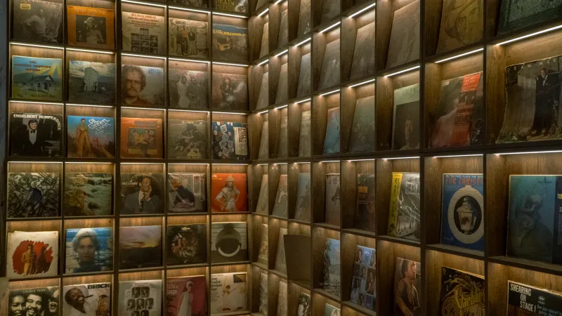
Every album cover you've ever loved started as an argument. Maybe it was a designer defending a concept to a skeptical A&R rep. Maybe it was an artist refusing to swap out a photograph that made a label's legal team sweat. Maybe it was a printer who called the whole thing unprintable. The finished artwork hanging on your wall — or archived in your CD case — is a survivor.
We dug into the history books, collector lore, and design archives to pull together 15 covers that came dangerously close to looking completely different. Or not existing at all.
1. The Beatles — Yesterday and Today (1966)
Let's start with the most famous near-miss in cover history. Capitol Records approved a photo of the Fab Four dressed in butcher's coats, draped in raw meat and dismembered doll parts. It shipped. Then someone panicked, and over 750,000 copies were recalled — some recalled copies had new, tame artwork pasted directly over the original, creating what collectors now call the "Trunk" cover. Original unaltered copies are among the most sought-after items in all of music memorabilia.
2. Jane's Addiction — Nothing's Shocking (1988)
Perry Farrell commissioned a sculpture of conjoined nude female twins with their hair on fire for this cover — and numerous major US retail chains simply refused to carry it. Warner Bros. briefly considered requiring an alternate sleeve. Farrell held the line, the artwork shipped as designed, and what could have been a forgotten compromise became a landmark image of late-80s alternative culture.
3. Nirvana — Nevermind (1991)
The naked baby swimming toward a dollar bill on a fishhook is one of the most reproduced images in rock history. It almost got swapped out. DGC Records executives raised concerns about the nudity, and a version with a strategically placed sticker was discussed. Kurt Cobain's response, according to multiple accounts, was characteristically direct: he suggested an even more explicit alternative if the label wanted to go that route. The original image stayed.
4. The Rolling Stones — Beggars Banquet (1968)
The Stones wanted a photograph of a graffiti-covered public restroom wall for the cover. Decca Records called it disgusting and refused to release it. The standoff lasted months, ultimately delaying the album significantly. A plain white card with formal script — a deliberate, ironic rebuke of the label's stuffiness — went out instead. The original bathroom photo wasn't officially published as the intended cover until a 1986 reissue finally restored Jagger and Richards' vision.
5. David Bowie — Diamond Dogs (1974)
Guy Peellaert's painting depicted Bowie as a half-human, half-dog hybrid — and included anatomically explicit details that RCA's printing team quietly airbrushed away without telling anyone. Bowie reportedly only discovered the alteration after copies were already in stores. The original uncensored artwork has appeared in retrospective books and is a consistent subject of fascination among Bowie archivists.
6. Prince — Lovesexy (1988)
The full-frontal floral nude photograph caused several US retail chains to shelve the album behind counters or decline to stock it entirely. Walmart refused it outright. Prince had already navigated the Parental Advisory sticker controversy, and this time he simply didn't blink. No alternate cover was produced. The image stayed, and the retail restrictions actually amplified the album's notoriety.
7. Blind Faith — Blind Faith (1969)
Atlantic Records in the US replaced the UK cover — a photograph of a topless preteen girl holding a model airplane — with a simple band photo before American release. The original image, photographed by Bob Seidemann, remains controversial and is rarely reproduced today. The US variant is what most American collectors grew up with, making original UK pressings with the Seidemann photograph both rare and complicated objects in the collector market.
8. Guns N' Roses — Appetite for Destruction (1987)
The original Robert Williams painting — depicting a robot assailant and a violated female figure — was the intended cover. Geffen Records pulled it after retailer pushback and replaced it with the now-iconic cross-and-skulls design. The original painting was relegated to the inner sleeve. First pressings with the Williams image as the actual front cover are among the most actively traded GN'R collectibles in circulation.
9. John Lennon & Yoko Ono — Two Virgins (1968)
Full-frontal photographs of Lennon and Ono on both the front and back cover caused the album to be banned outright in several US states and shipped in plain brown paper bags in markets where it was technically legal. EMI refused to distribute it entirely in the UK. Even today, finding a clean, unbagged original pressing is a minor collector achievement.
10. Kanye West — My Beautiful Dark Twisted Fantasy (2010)
George Condo's painting — depicting West as a winged figure with a nude female figure — was rejected by iTunes and several retail partners, forcing an edited version into most digital storefronts. The full uncensored artwork was available on physical copies, creating one of the more recent cases where owning the CD meant owning something meaningfully different from the digital version. It's a neat argument for physical media that collectors love to cite.
11. Metallica — Metallica (The Black Album, 1991)
This one goes the other direction: the band chose near-total minimalism after label pressure pushed toward something more visually elaborate. Producer Bob Rock and the band resisted, insisting the coiled snake on a field of black was sufficient. Elektra Records was reportedly uneasy about selling what looked like a blank record. The cover became one of the most recognized in heavy metal history, and the restraint is now understood as a deliberate power move.
12. The Velvet Underground — The Velvet Underground & Nico (1967)
Andy Warhol's peelable banana design was an engineering and printing nightmare that most facilities initially refused to attempt. The instruction to "Peel slowly and see" was nearly dropped for a static image. Original pressings with the actual peelable banana intact — revealing a flesh-colored banana beneath — are among the most prized objects in any serious collection, precisely because so many people did exactly what they were told.
13. N.W.A — Straight Outta Compton (1988)
Priority Records operated with a lean budget, and the now-iconic cover — shot quickly in Compton with a fish-eye lens — was nearly scrapped for something more conventionally commercial. The raw, confrontational image that survived those budget conversations became the visual template for an entire genre. Alternate concepts reportedly existed but were never fully developed.
14. Pink Floyd — The Wall (1979)
Gerald Scarfe's deliberately stark white brick design was considered commercially risky by nearly everyone at Columbia Records who saw it. No band name on the front. No obvious visual hook. Multiple executives pushed for something with more immediate shelf appeal. Roger Waters didn't move. The cover became so synonymous with the album that the image of a plain white wall now functions as shorthand for an entire era of progressive rock.
15. Rage Against the Machine — Rage Against the Machine (1992)
The cover photograph — Eddie Adams's 1968 Pulitzer Prize-winning image of a Vietnamese prisoner being executed — required extensive negotiation with Adams and navigating complex ethical questions about the use of a real historical atrocity as commercial artwork. Epic Records had significant reservations. The band insisted the discomfort was the point. Adams ultimately gave his blessing, the image was used, and the cover became one of the most politically charged sleeves in rock history.
The Bigger Picture
What unites these stories isn't just drama — it's the consistent pattern of artists understanding that the cover is part of the work. The image isn't decoration for the music; it's the first argument the record makes about what it is and why it matters.
For collectors, these near-misses add layers of meaning to every pressing variant, every regional edition, every alternate sleeve sitting in a protective sleeve somewhere. When you hold a first pressing of Appetite for Destruction with the Williams painting on the front, you're holding a document of a specific moment when someone pushed back against the safe choice — and the safe choice almost won.
That's what makes this stuff worth preserving. The music is the music. But the cover is the story of how the music got to you.